The Role Of Typography In Web Design

When it comes to designing a website, there are many elements to consider, from layout and color scheme to images and content. However, one crucial aspect that is often overlooked is typography.
Typography refers to the style, arrangement, and appearance of text on a page, and it plays a vital role in how users perceive and interact with your website. In fact, typography can make or break the user experience, so it’s essential to pay attention to this often underappreciated design element.
To fully understand the importance of typography in web design, it’s essential to explore its impact on user psychology. Studies have shown that typography can influence how users read and comprehend information, as well as their emotional response to it. Therefore, by choosing the right typography for your website, you can enhance user engagement, improve readability, and convey your brand’s personality and values.
In this article, we’ll delve into the role of typography in web design, from understanding the basics of typography to choosing the right typeface and creating hierarchy and contrast.
Key Takeaways
- Typography is a crucial aspect of web design that influences reading, comprehension, and emotional response.
- Understanding typography anatomy, font personality, size, and spacing is essential for creating hierarchy and guiding the reader through content.
- Typography plays a crucial role in building brand identity, communicating values, personality, and tone.
- Best practices in typography focus on legibility, contrast, hierarchy, and limiting the number of typefaces used consistently throughout the website.
The Psychology of Typography in Web Design
You might not realize it, but the psychology of typography in web design plays a crucial role in how users perceive and interact with your website.
Every font has its own personality, and choosing the right one can create a specific tone and emotion, which can influence the user’s behavior.
For example, serif fonts are viewed as more traditional and trustworthy, while sans-serif fonts are perceived as more modern and clean. These subtle differences can have a big impact on a user’s perception of your website and your brand.
Additionally, the size and spacing of your typography can affect the user experience as well. Smaller fonts can be perceived as more professional and serious, while larger fonts can convey a sense of playfulness and informality.
The spacing between letters and lines can also affect readability and the user’s ability to quickly scan content. By understanding the psychology behind typography, you can create a more effective and engaging website that resonates with your target audience.
Anatomy of Typography: Understanding the Basics
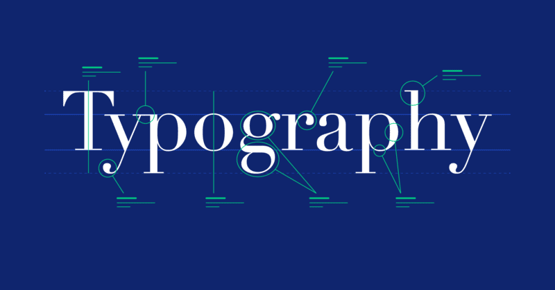
Get ready to dive into the basics of typography by understanding its anatomy. Typography is essentially the art of arranging type to make written language legible, readable, and appealing when displayed.
In order to create effective typography in web design, it’s important to have a basic understanding of the anatomy of typography. The anatomy of typography consists of various terms and concepts that are essential to creating great typography.
Some important components include the typeface, which is the design of the letters, and the font, which is the digital file that contains the typeface. Other important elements include the point size, which refers to the height of the letters, and the line spacing, which refers to the space between lines.
By understanding the anatomy of typography, you can create visually appealing and effective designs that will grab the attention of your audience and make your website stand out from the rest.
Choosing the Right Typeface for Your Website
Picking the perfect typeface can make or break the overall aesthetic of your website, so it’s crucial to choose one that aligns with the tone and personality of your brand.
When choosing a typeface, consider the purpose of your website and the message you want to convey. For example, if you’re creating a website for a law firm, a traditional, serif typeface may be more appropriate than a playful, handwritten font.
It’s also important to consider readability when choosing a typeface. Make sure the font you choose is legible, especially in smaller sizes or on different devices. Additionally, consider the hierarchy of your content and use different weights or styles to differentiate between headings, subheadings, and body text.
Remember, the typeface you choose is a reflection of your brand, so take the time to find one that not only looks great but also accurately represents your brand’s personality and values.
Creating Hierarchy with Typography
By using different weights, sizes, and styles for your headings, subheadings, and body text, you can create a visual hierarchy that guides the reader through your content. This hierarchy is important because it allows the reader to quickly and easily understand the structure of your page and identify the most important information.
Here are some tips for creating hierarchy with typography:
-
Use a larger font size for your headings than for your body text. This will make your headings stand out and draw the reader’s eye to them.
-
Use bold or italic text to emphasize important words or phrases. This will help the reader understand what is most important on the page.
-
Use a different font for your headings and body text. This will help distinguish between the different levels of information and make it easier for the reader to follow along.
Overall, creating hierarchy with typography is an essential part of web design. By using different fonts, sizes, and styles, you can guide the reader through your content and ensure that they understand the most important information on your page.
So, take the time to carefully choose your typography and create a hierarchy that will make your website easy to navigate and understand.
Creating Contrast and Balance with Typography
You can easily capture your audience’s attention and create a visually stunning website by incorporating contrasting and balanced typography. Contrasting typography involves pairing two different fonts that complement each other. For example, you could use a bold sans-serif font for headers and a delicate script font for body text. This contrast in styles creates a visual interest that draws the reader’s eye and makes your website stand out.
To achieve a balanced design, you need to consider the placement and size of your typography. A well-balanced website uses typography to create a sense of harmony and flow. To help you visualize the concept of balance in typography, consider the table below. It showcases different font sizes and weights and how they can be used to create a balanced layout. By playing with the size, weight, and placement of your typography, you can create a visually stunning website that captures your audience’s attention and keeps them engaged.
| Header 1 | Header 2 | Header 3 | Header 4 | Header 5 |
|---|---|---|---|---|
| Large, bold sans-serif | Medium, italic serif | Small, regular sans-serif | Large, regular serif | Medium, bold sans-serif |
| Centered | Left-aligned | Right-aligned | Centered | Left-aligned |
Using Color and Typography Together
Now that you’ve learned how to create contrast and balance with typography, let’s take it a step further by exploring the use of color and typography together.
Using color in typography can make your website more visually appealing and can convey a specific message to your audience. One way to use color and typography together is by choosing a color scheme that complements your typography. This can enhance the overall aesthetic of your website and create a cohesive design.
Another way is by using color to highlight specific words or phrases in your typography. This can draw attention to important information and make it easier for your audience to navigate your website.
Here are some tips on how to effectively use color and typography together:
- Choose a color scheme that complements your typography
- Use color to highlight important information
- Experiment with different color and typography combinations to find what works best for your website
- Remember to keep it simple and don’t use too many colors or fonts
- Use color and typography to create hierarchy and guide your audience through your website
By incorporating color and typography together, you can create a visually stunning website that’s easy to navigate and conveys your message effectively. So, go ahead and experiment with different color and typography combinations to find what works best for your website.
Typography and Brand Identity
Incorporating typography into a brand’s identity can elevate its overall aesthetic and convey a sense of professionalism and sophistication. Typography is a crucial element in building brand identity, as it is the visual representation of a company’s personality and values. Choosing the right typography can help to create a strong brand identity that is memorable and recognizable.
The table below shows examples of famous brands and their respective typefaces. These choices were not made arbitrarily; rather, they were intentionally selected to communicate the brand’s values, personality, and tone. By analyzing these examples, you can understand how typography plays a crucial role in building a brand’s identity.
| Brand | Typeface |
|---|---|
| Coca-Cola | Spencerian Script |
| Apple | San Francisco |
| Nike | Futura |
| Product Sans |
Typography is an essential element in web design, and it can significantly impact a brand’s identity. By carefully choosing the right typeface, designers can create a brand identity that communicates the company’s values, personality, and tone. Use the table above as a guide to help you make informed typography choices that will help to create a strong brand identity.
Best Practices for Typography in Web Design
When choosing typefaces for your website, it’s important to consider legibility, contrast, and hierarchy to ensure a cohesive and visually pleasing user experience.
Legibility refers to how easily the text can be read, so it’s important to choose typefaces that are clear and easy to read. Contrast refers to the difference between the text and the background, so it’s important to choose colors that have enough contrast to make the text readable. Hierarchy refers to the way the text is organized on the page, so it’s important to choose typefaces that can be used for headings, subheadings, and body text to create a clear hierarchy.
Another best practice for typography in web design is to limit the number of typefaces used on a page. Using too many different typefaces can make the page look cluttered and confusing. Stick to two or three typefaces that complement each other and use them consistently throughout the website.
It’s also important to consider the size of the text and spacing between lines, as this can impact the overall readability of the page. By following these best practices, you can create a visually appealing and easy-to-read website that engages users and keeps them coming back.
Conclusion
So, now that you understand the role of typography in web design, it’s time to put that knowledge into action.
Remember to choose a typeface that fits your website’s purpose and audience, and to use hierarchy, contrast, and color to create balance and visual interest.
It’s also important to consider your brand identity and use typography to enhance it, rather than detract from it.
By following these best practices and taking the time to carefully consider your typography choices, you can create a website that not only looks great but also effectively communicates your message to your audience.
So go ahead, start experimenting with different fonts, sizes, and colors, and see how typography can elevate your web design game!


